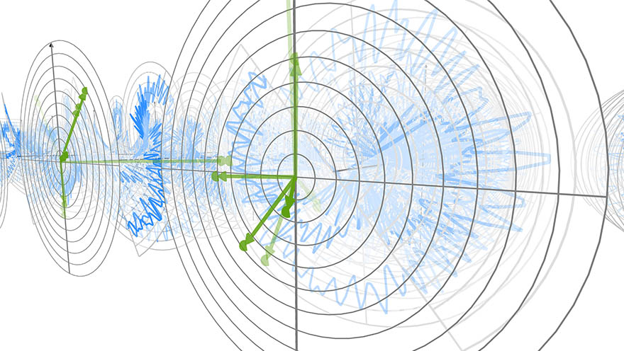
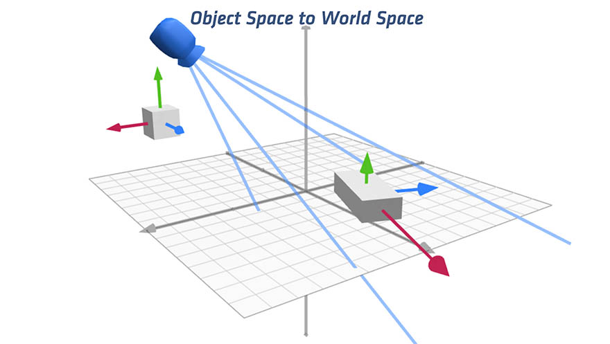
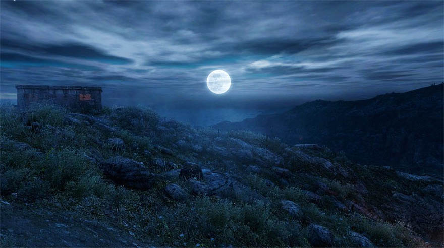
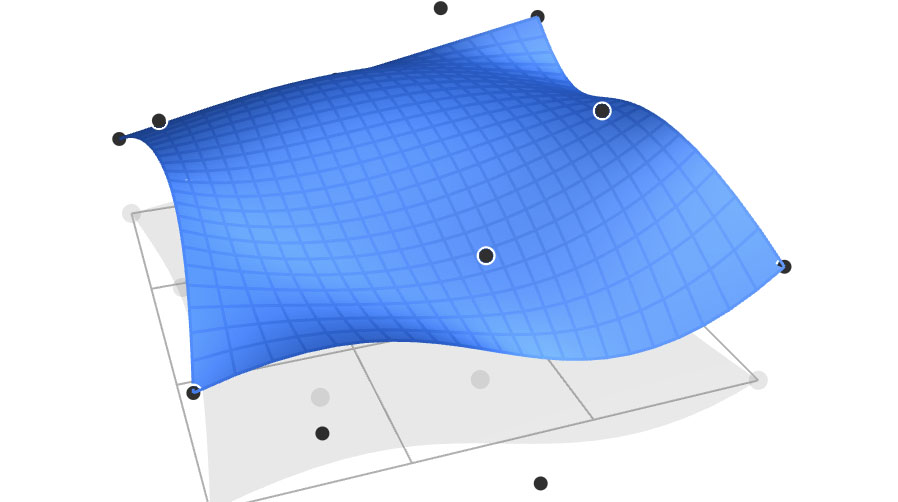
Animate Your Way to Glory Putting math into motion and controlling it precisely, with a little help from Isaac Newton and Admiral Ackbar.
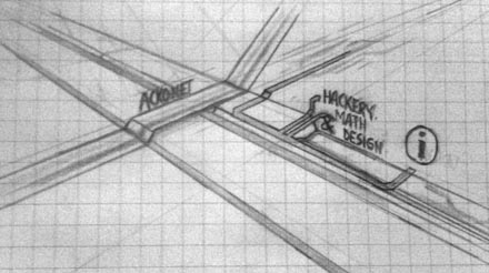
Zero to Sixty in One Second A new design for Acko.net, fusing WebGL, CSS 3D and HTML at sixty frames per second.
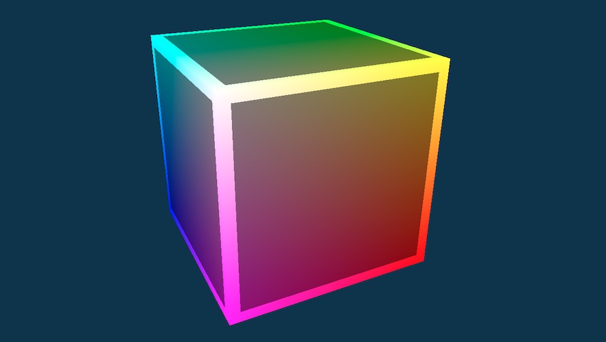
On WebGL You can transform your ordinary browser into a lush 3D world with one click. Why should you care?
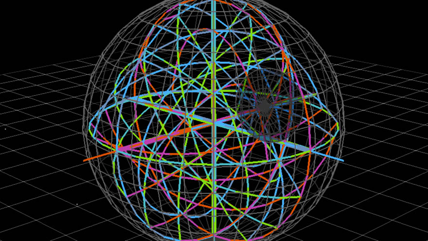
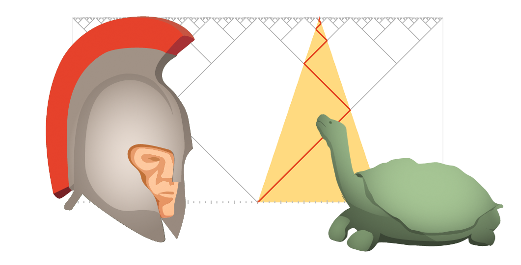
To Infinity… And Beyond! Exploring the outer limits: on the nature of infinity, continuity and convergence.
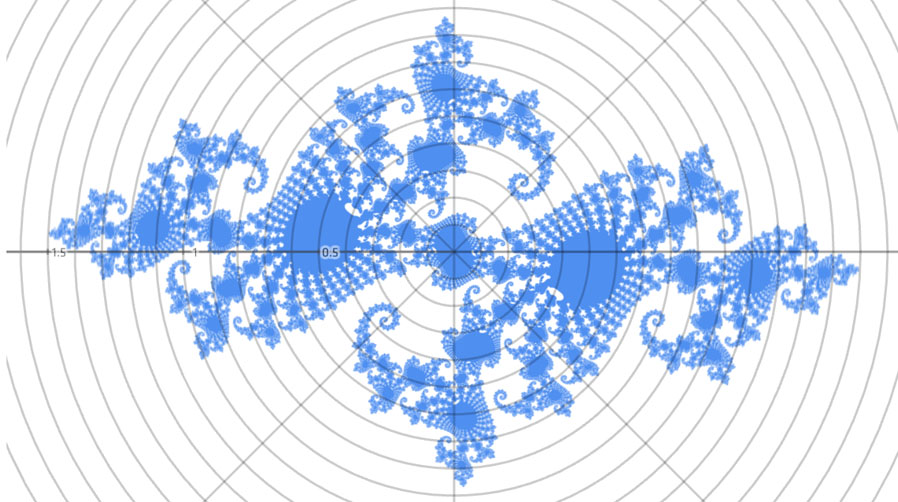
How to Fold a Julia Fractal A tale of numbers that like to turn: a different look at complex numbers and the strange things they do.
Making Love to WebKit If the world is going to end in 2012, Acko.net will at least go out in style: I've redesigned.
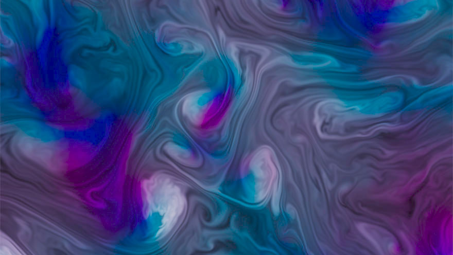
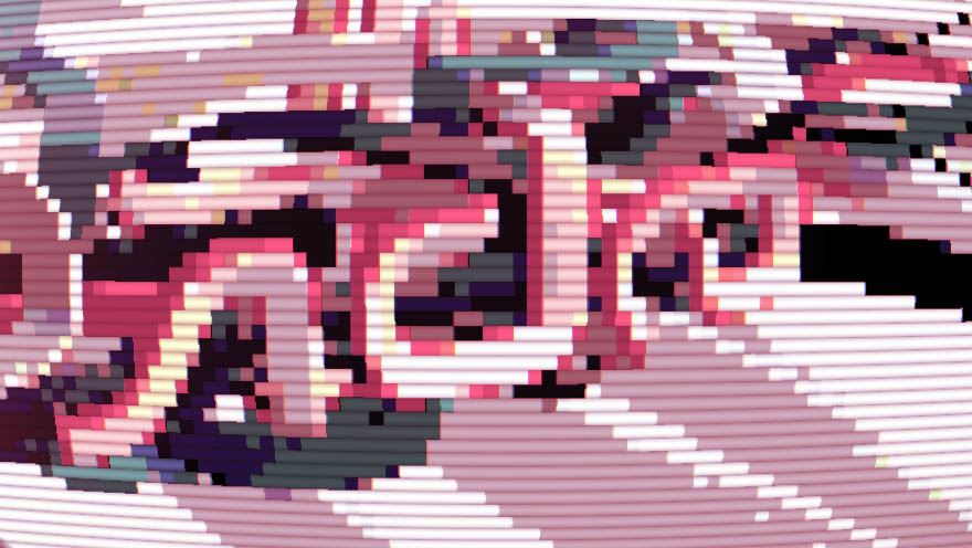
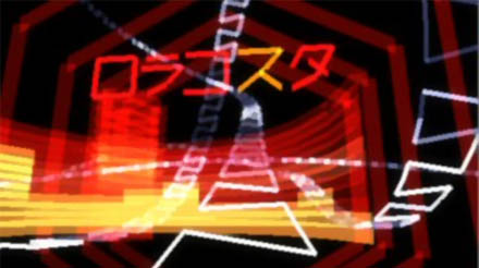
My JS1K Demo - The Making Of I couldn't resist making a demo for the JS1K contest. So I pulled out my bag of tricks from my Winamp visualization days.
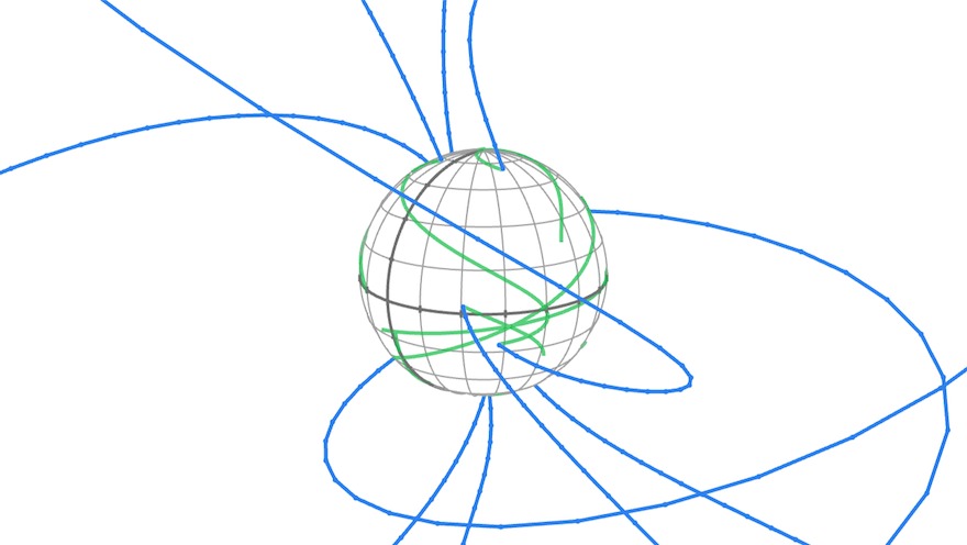
Making Worlds: Introduction In this multi-part series I try to make a procedural planet generator that runs on the GPU.
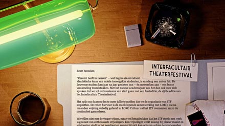
Noir meets web I designed a 'farewell' page for Leuven Speelt, a student theater group run by friends.
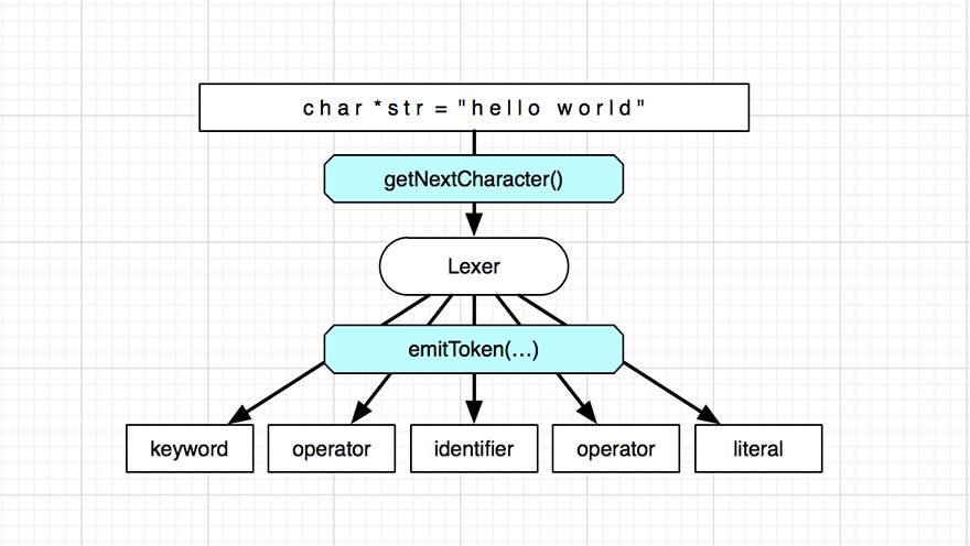
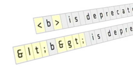
Safe String Theory for the Web A thorough breakdown of the thorny problem of handling textual data on and around the web.
Advanced Visualization Studio AVS was a music visualizer that shipped with Winamp, popular in the early 2000s. I made lots of visuals for it.